Nokia N-Gage Brand

Background
Nokia was releasing the first mobile gaming phone in the industry. The device could connect to another to compete with a friend. This landmark product had to have a brand image created around it, that resonated with hardcore gamers.
The Journey
Counter to competitors in the gaming industry, that focused on a wide range of ages and maturity, N-Gage was focused on having an edgy and sleek image. The logo and motion lines created a consistent language and shapes on application. The darker palette gave a more serious tone.

Sketch for a oval package that defied gravity

Packaging for Series 2, Nokia QD
Brand Application

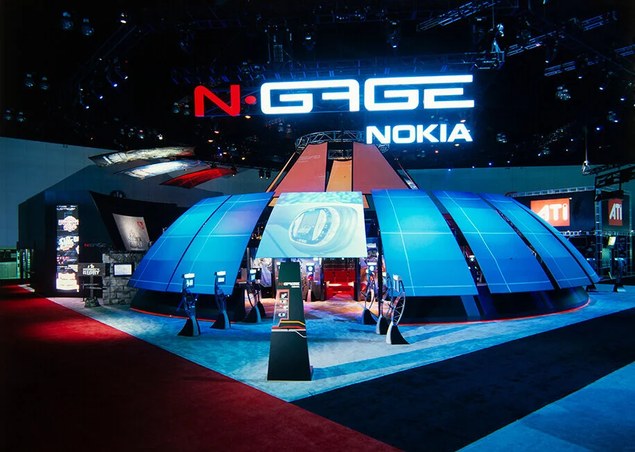
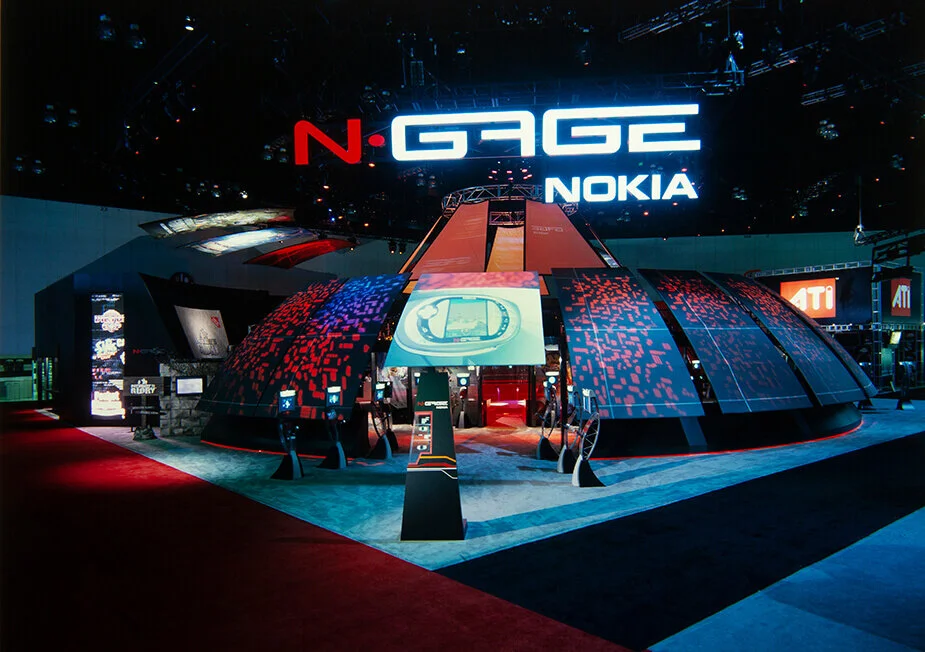
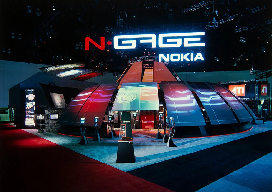
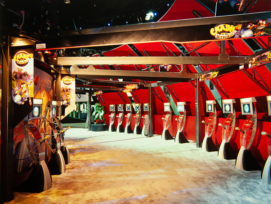
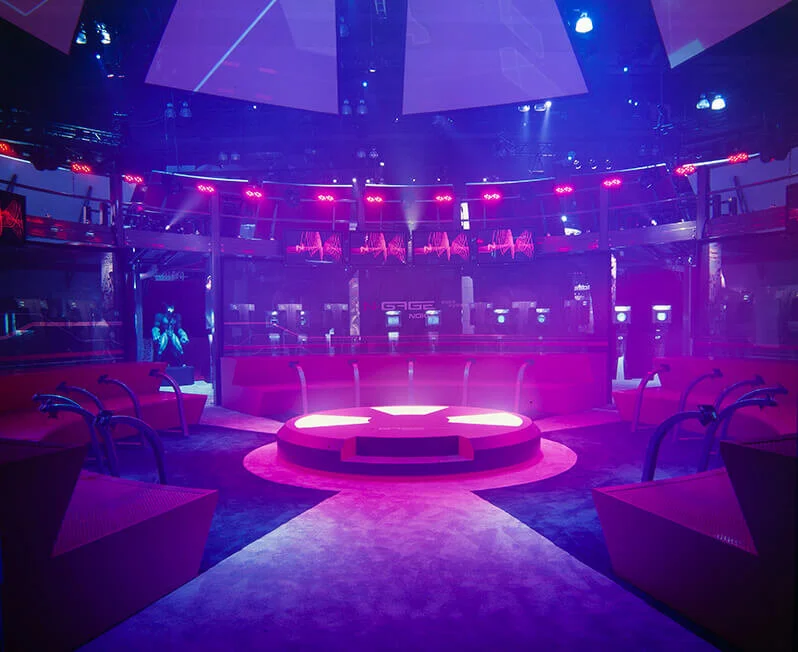
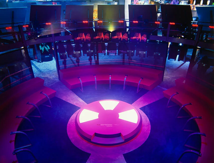
e3 Exhibit, Los Angeles Convention Center
For the e3 trade show, I was challenged to manage a team of illustrators, industrial designers, exhibit designers to help conceptualize and create the exhibit booth in three months time, with a budget of $2.1M.
After a full exploration, we arrived at the concept of an arena, which was based off of the brand pattern of squares. The exhibit was two stories, with a footprint of 60’x60’. The exhibit won an e3 award for excellence and drew press coverage.